- Home
- Company
- About Us
- CI
CI
Meanings of the Symbol
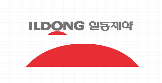
As the most important and fundamental representation of the Ildong Pharmaceutical Group, our logo is a visual expression of the meaning behind the Ildong name. It depicts the morning sun during its ascent in the East Sea and symbolizes hope, peace, and health.
The letter O in the Ildong name has been purposefully positioned above the image of a red sun rising above the horizon to create a unique and powerful statement regarding Ildong’s relationship with the rising sun and distinct identity.
Logo Description
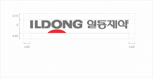
Ildong Pharmaceutical’s logos prominently feature the company’s name in gentle and reassuring font types and were designed to communicate the company’s pharmaceutical nature.
Font types with rounded corners were chosen to convey an image of softness and stability, and the logos themselves were designed for high visibility and readability, especially when featured on large signage.
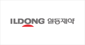 Bilateral combination
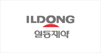 Vertical combination
 Korean combination
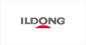 English
Color Specification
The exclusive colors of Ildong Pharmaceutical are classified into Main Color and Sub Color depending on their importance.
The main color is ILDONG Gray and ILDONG Red in Ildong Bioscience symbol.
- MAIN COLOR
-
 ILDONG GRAY
Pantone 418 C
CMYK 49/40/41/4 ILDONG RED
Pantone 185 C
CMYK 3/100/99/1
